First thing I recognized at the Zero 2012 the angle of view of the dash will not allow to read the Charge Indicator.
I can't see the upper bar and the dash position above the light with a connector pointing out over the headlight shield is ugly.
I guess the designer forgot that the dash has this bulky connector and when the holder was finished it was to late

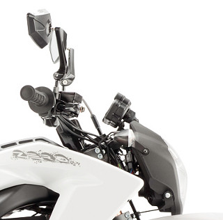 01_OrginalDash
 von
BSDThw auf Flickr
Am I the only one with this feelings?
What to do

I had to look at leftover in my garage. And I saw this.
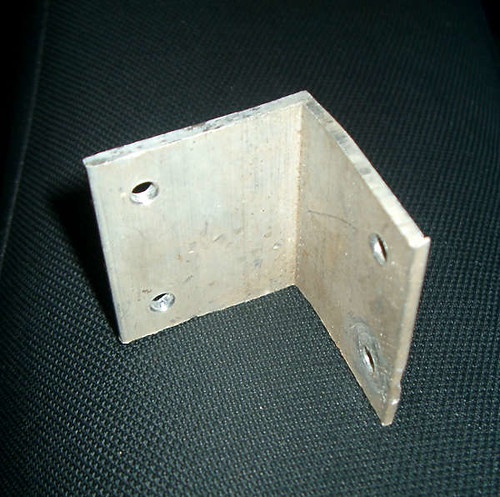 03_Material
 von
BSDThw auf Flickr
Next: give it a nice shape

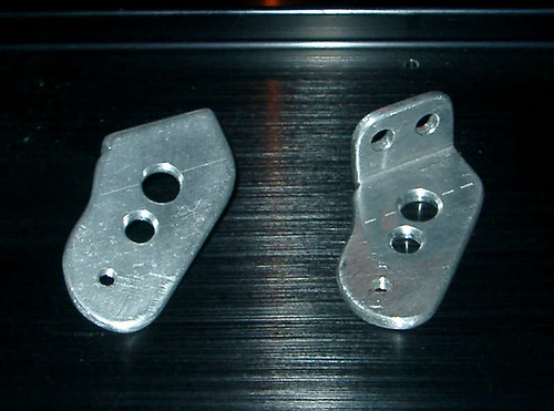 04_NewHolder
 von
BSDThw auf Flickr
Test if it really fits as planned. Will not end up like the Zero Designer

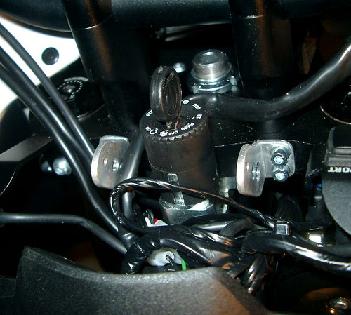 06_NewHolder
 von
BSDThw auf Flickr
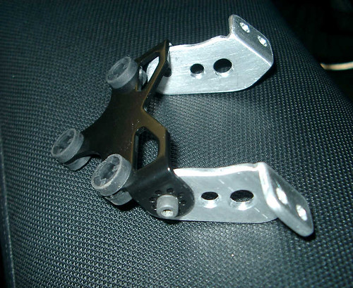 05_NewHolder
 von
BSDThw auf Flickr
It is too shiny but believe painting aluminum is a pain even if the paint is for aluminum use. ( but I always suck with painting )

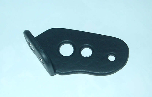 07_NewHolder
 von
BSDThw auf Flickr
Assemble all the parts.
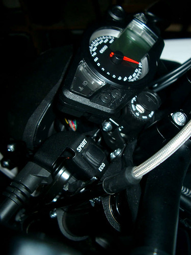 08_NewHolder
 von
BSDThw auf Flickr
If somebody hear trying to do a similar mod, always look for enough clearance between dash and key!
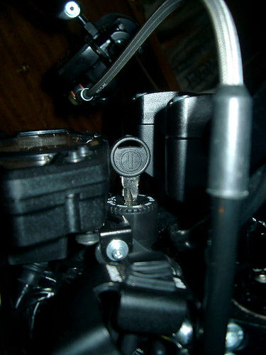 09_NewHolder
 von
BSDThw auf Flickr
Sorry the pics are not good, but it rains today and I had not enough distance to get sharp pictures.
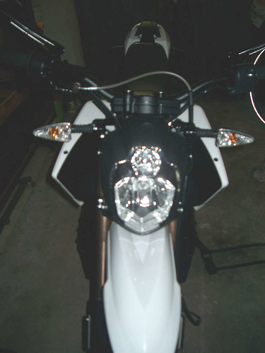 10_NewLook
 von
BSDThw auf Flickr
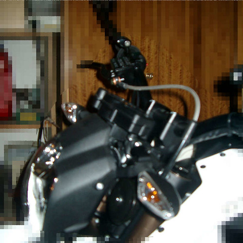 11_NewLook
 von
BSDThw auf Flickr
Hope I didn't bore with this unspectacular Mod, but i like it


 Author
Topic: Zero DS 2012 Dash Board / Instrument Panel Mod (Read 2605 times)
